A practical, in-depth guide to Python visualization
Python
Data Visualization
Matplotlib
Tutorial
Author
Rishabh Mondal
Published
February 15, 2026
Welcome!
Level 1 (Fundamentals): Core plotting, labels, styling, and saving figures
Level 2 (Intermediate): Subplots, chart selection, annotations, and statistical plots
Level 3 (Advanced): OO API, 3D plots, animations, colormaps, and professional techniques
Level 4 (Expert): Custom projections, advanced layouts, and production-ready code
Use this as a comprehensive reference, interview preparation guide, or project companion.
Learning Roadmap
Level
Focus
Outcome
Fundamentals
Line plots, bar charts, labels, grid, saving
Create clean, publication-ready basic charts
Intermediate
Subplots, scatter, histograms, pie charts, annotations
Build multi-panel figures with clear insights
Advanced
OO API, 3D plots, colormaps, box/violin plots, heatmaps
Design professional dashboards and complex visualizations
Expert
GridSpec, animations, custom styles, transforms
Create production-grade, reusable plotting systems
Part 1: Fundamentals
Q1. What is Matplotlib and why is it essential for data visualization?
Answer: Matplotlib is Python’s foundational 2D plotting library, created by John Hunter in 2003. It provides:
Complete control over every plot element (axes, ticks, labels, colors)
Publication-quality output in multiple formats (PNG, PDF, SVG, EPS)
Integration with NumPy, Pandas, and the entire scientific Python ecosystem
Two interfaces: quick pyplot (MATLAB-style) and powerful object-oriented API
import numpy as npimport matplotlib.pyplot as pltimport matplotlib as mplprint(f"Matplotlib version: {mpl.__version__}")print(f"Available backends: {mpl.rcsetup.all_backends[:5]}...")
Matplotlib version: 3.7.5
Available backends: ['GTK3Agg', 'GTK3Cairo', 'GTK4Agg', 'GTK4Cairo', 'MacOSX']...
Note
If Matplotlib is missing, install it with:
pip install matplotlib
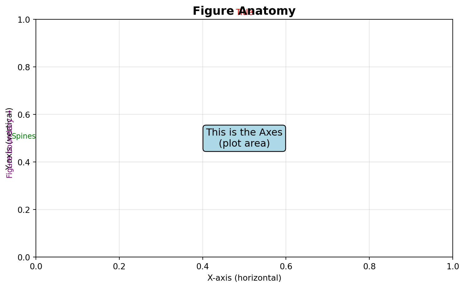
Q2. What are the key parts of a Matplotlib figure?
Answer: Every Matplotlib visualization consists of:
Figure: The entire window/page containing everything
Axes: The actual plot area with data, ticks, labels (a Figure can have multiple Axes)
Axis: The x-axis and y-axis objects controlling ticks and limits
Artist: Everything visible on the figure (lines, text, patches, etc.)
Create a simple line plot of \(y = x^2\) for x ∈ [0, 10].
Requirements: - Blue solid line with linewidth=2 - Title: “Quadratic Function” - X and Y axis labels - Grid enabled
Challenge 2 (Easy): Multiple Lines with Legend
Plot \(y = x\), \(y = x^2\), and \(y = x^3\) on the same figure for x ∈ [0, 3].
Requirements: - Different colors for each line - Line labels and legend - Add grid with alpha=0.3
Challenge 3 (Moderate): Customized Sine Waves
Create a figure showing \(\sin(x)\), \(\sin(2x)\), and \(\sin(3x)\) for x ∈ [0, 2π].
Requirements: - Different line styles (solid, dashed, dotted) - Custom colors (not default) - Legend positioned at ‘upper right’ - Add horizontal line at y=0 - Custom x-ticks at [0, π/2, π, 3π/2, 2π] with labels [‘0’, ‘π/2’, ‘π’, ‘3π/2’, ‘2π’]
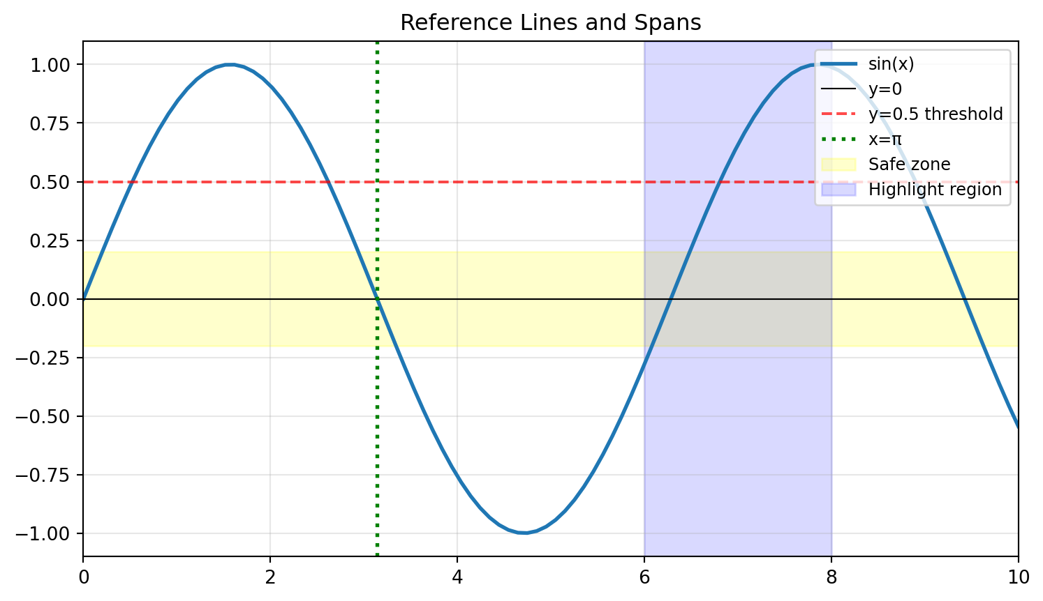
Challenge 4 (Moderate): Reference Lines and Spans
Plot \(y = e^{-x} \cdot \cos(2\pi x)\) for x ∈ [0, 5].
Requirements: - Highlight the region where |y| < 0.2 using axhspan - Add vertical lines at x = 1, 2, 3, 4 using axvline - Mark the envelope curves \(\pm e^{-x}\) with dashed lines - Proper annotations explaining what each element represents
Create a plot showing three exponential decay curves: \(e^{-x}\), \(e^{-2x}\), and \(e^{-0.5x}\) for x ∈ [0, 5].
Requirements: 1. Different line styles and colors for each curve 2. A horizontal line at y=0.1 (threshold) 3. Vertical line where \(e^{-x}\) crosses the threshold (x = ln(10) ≈ 2.303) 4. Annotation pointing to the intersection 5. LaTeX labels: \(e^{-x}\), \(e^{-2x}\), \(e^{-0.5x}\) 6. Legend with title “Decay Rates” 7. Save as both PNG (300 DPI) and SVG
Part 2: Intermediate Visualizations
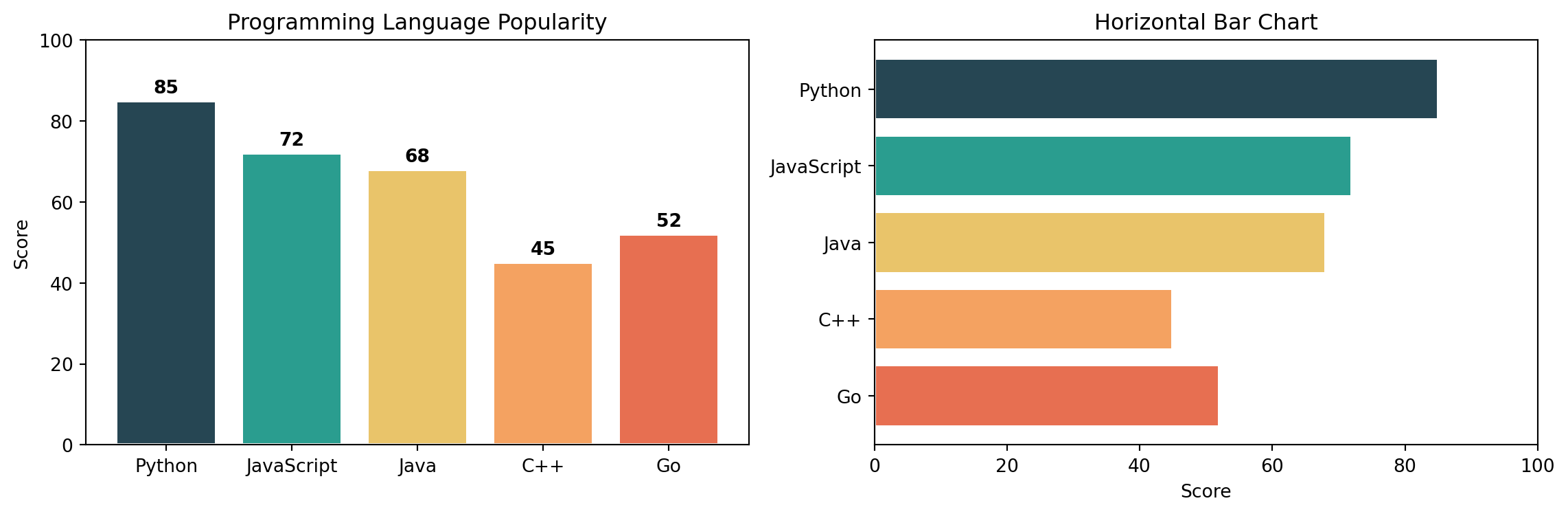
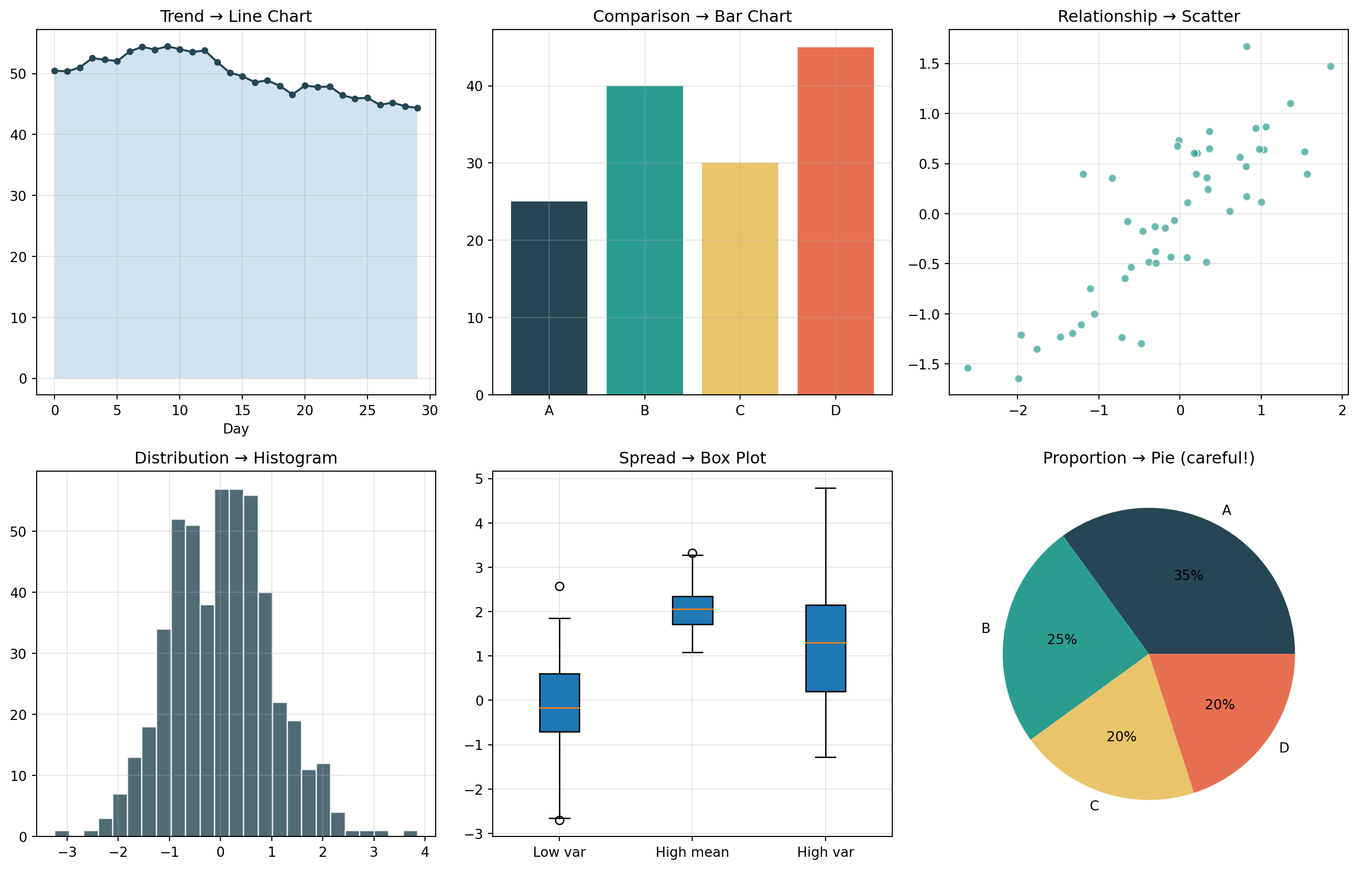
Q11. How do I create bar charts (vertical and horizontal)?
Answer: Use bar() for vertical and barh() for horizontal bars.
categories = ['Python', 'JavaScript', 'Java', 'C++', 'Go']values = [85, 72, 68, 45, 52]colors = ['#264653', '#2a9d8f', '#e9c46a', '#f4a261', '#e76f51']fig, axs = plt.subplots(1, 2, figsize=(12, 4))# Vertical barsaxs[0].bar(categories, values, color=colors, edgecolor='white', linewidth=1.5)axs[0].set_title("Programming Language Popularity")axs[0].set_ylabel("Score")axs[0].set_ylim(0, 100)# Add value labels on barsfor i, (cat, val) inenumerate(zip(categories, values)): axs[0].text(i, val +2, str(val), ha='center', fontweight='bold')# Horizontal barsaxs[1].barh(categories, values, color=colors, edgecolor='white', linewidth=1.5)axs[1].set_title("Horizontal Bar Chart")axs[1].set_xlabel("Score")axs[1].set_xlim(0, 100)axs[1].invert_yaxis() # Top category firstplt.tight_layout()plt.show()
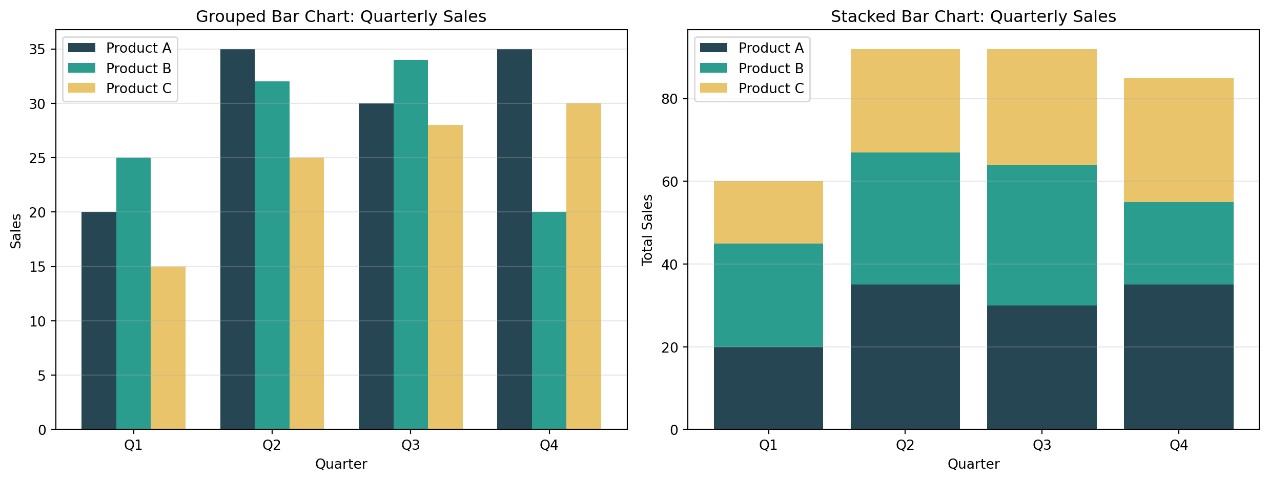
Q12. How do I create grouped and stacked bar charts?
Answer: For grouped bars, offset the x positions. For stacked, use the bottom parameter.
Create a bar chart comparing sales across 5 products: [‘Laptop’, ‘Phone’, ‘Tablet’, ‘Watch’, ‘Earbuds’] with values [150, 280, 95, 120, 200].
Requirements: - Different color for each bar - Add value labels on top of each bar - Title and axis labels - Grid on y-axis only
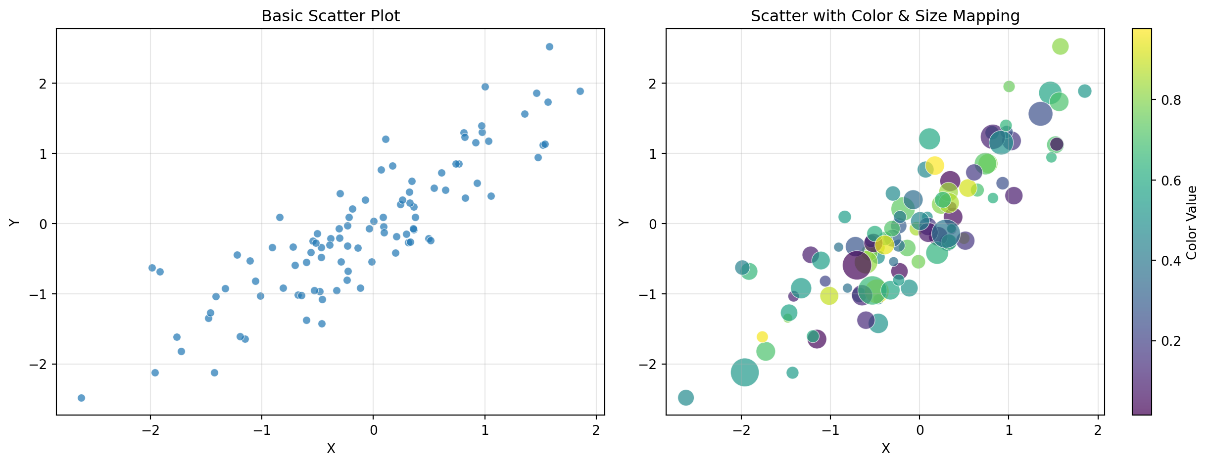
Challenge 2 (Easy): Simple Scatter Plot
Generate 50 random points (x from uniform [0, 10], y = 2x + noise).
Requirements: - Scatter plot with alpha=0.7 - Different marker size based on y-value - Add a trend line (y = 2x) - Legend distinguishing data vs. trend
Challenge 3 (Moderate): Grouped Bar Chart with Error Bars
Compare performance metrics across 4 teams for 3 quarters.
Requirements: - Grouped bars (3 groups of 4 bars each) - Error bars representing standard deviation - Different colors per quarter - Rotated x-tick labels - Legend outside the plot area
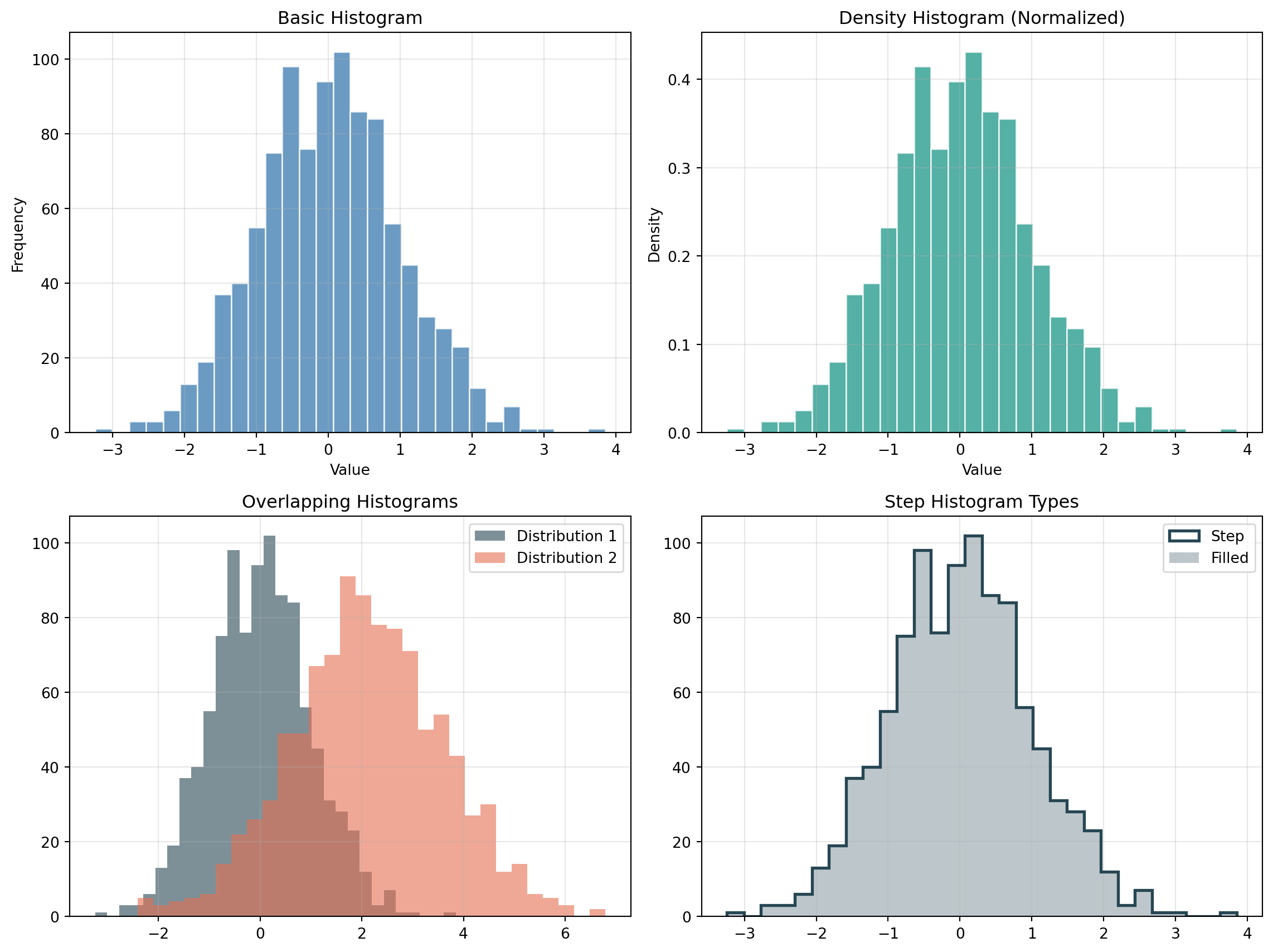
Challenge 4 (Moderate): Histogram with Statistical Annotations
Generate 1000 samples from a normal distribution (mean=75, std=10).
Requirements: - Histogram with 30 bins - Overlay a density curve (kernel density estimate or theoretical normal) - Vertical lines showing mean and ±1σ, ±2σ - Text annotation showing mean and standard deviation values - Different colors for each region (within 1σ, between 1σ-2σ, beyond 2σ)
Create a 2×2 subplot panel analyzing mock business data:
Requirements: 1. Top-left: Monthly revenue time series (line chart with fill_between showing growth area) 2. Top-right: Revenue by product category (horizontal bar chart, sorted by value) 3. Bottom-left: Revenue vs. expenses scatter plot with: - Color representing profit margin - Size representing transaction volume - Colorbar showing profit scale 4. Bottom-right: Distribution of daily transactions (histogram with overlaid density curve)
Add: - Super title: “Business Analytics Dashboard” - Consistent color scheme across all panels - Proper annotations for key insights (e.g., best month, highest margin product)
Part 3: Advanced Visualizations
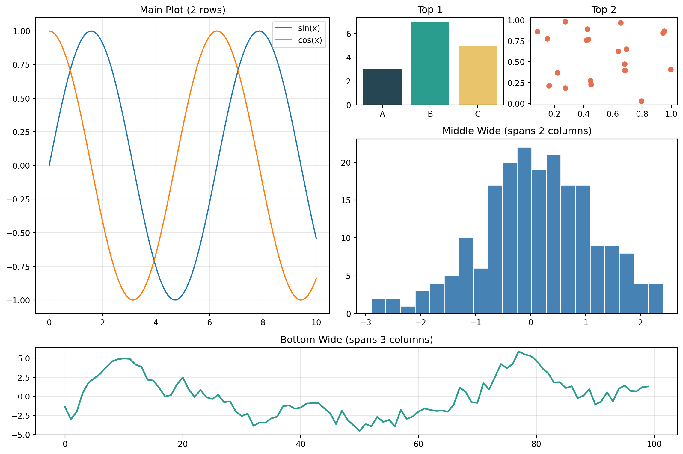
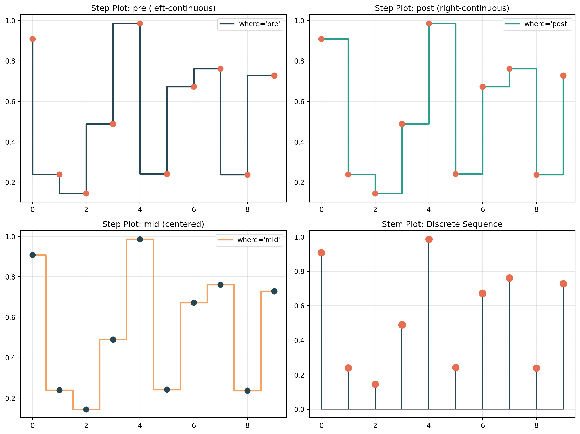
Q23. How do I use GridSpec for complex subplot layouts?
Answer:GridSpec provides fine-grained control over subplot sizes and arrangements.
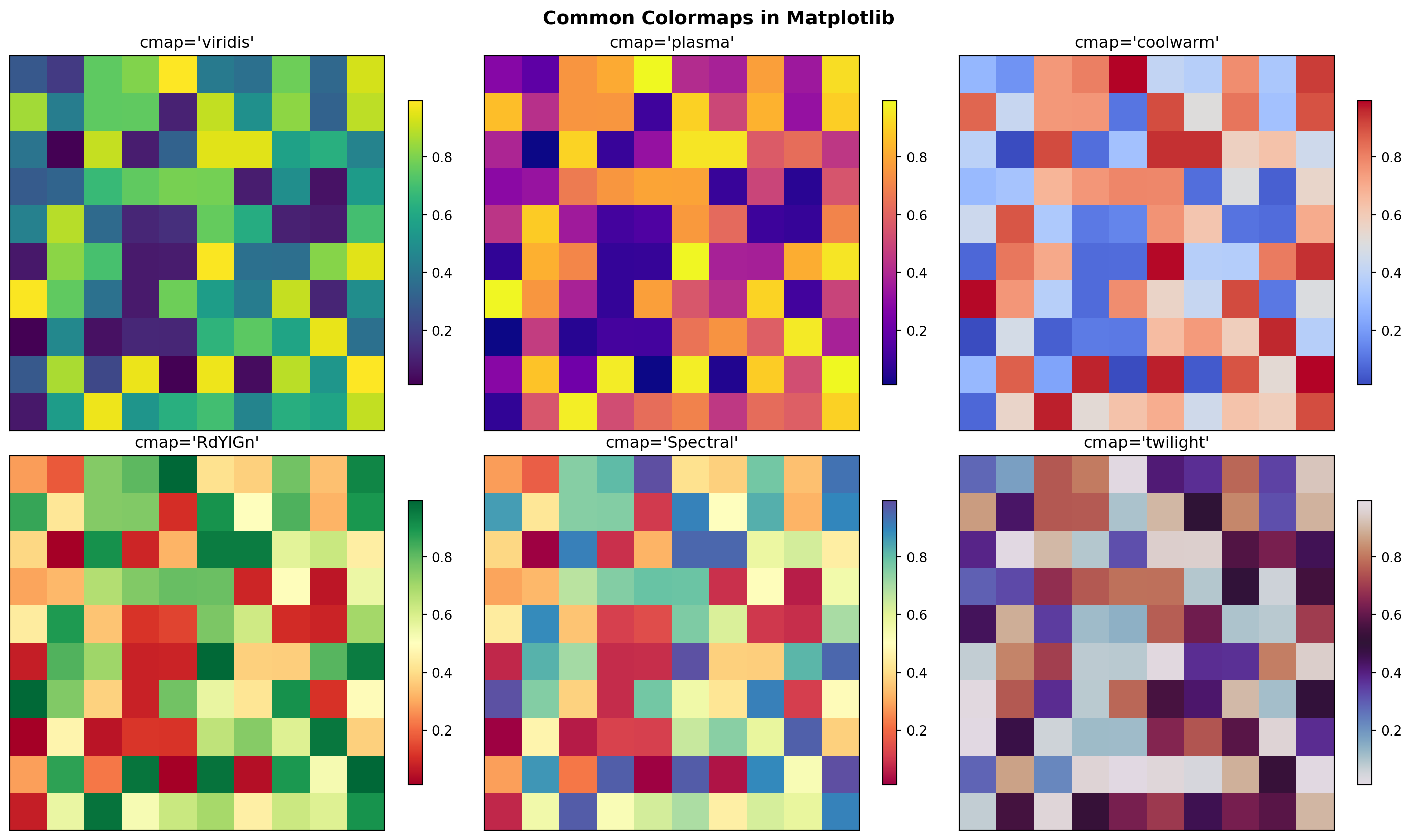
Requirements: - Use ‘viridis’ colormap - Add colorbar with label - Row and column labels - Title
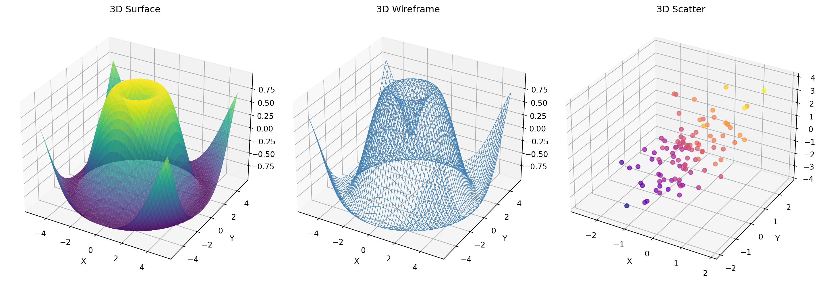
Challenge 2 (Easy): Simple 3D Plot
Create a 3D surface plot of \(z = \sin(\sqrt{x^2 + y^2})\) for x, y ∈ [-5, 5].
Requirements: - Use ‘coolwarm’ colormap - Set appropriate viewing angle - Label all three axes - Add title
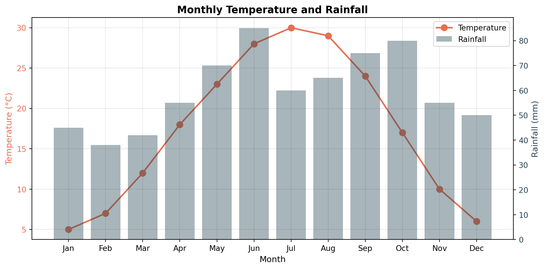
Challenge 3 (Moderate): Dual-Axis Time Series
Plot temperature and humidity over 30 days.
Requirements: - Temperature on left y-axis (°C), humidity on right y-axis (%) - Different colors matching y-axis label colors - Combined legend - Shaded region highlighting days where both metrics exceeded thresholds - Grid aligned with primary axis
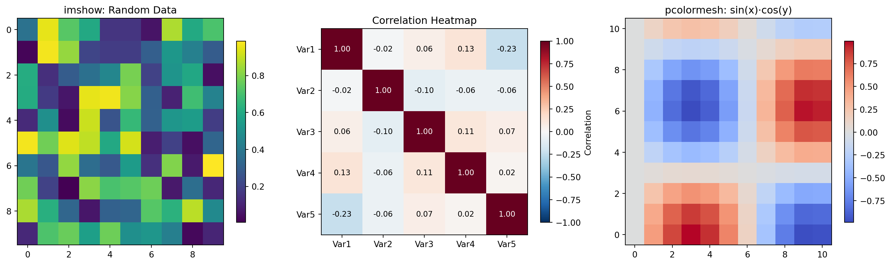
Create a correlation matrix visualization for 6 variables.
Requirements: - Symmetric heatmap with diagonal of 1s - Diverging colormap centered at 0 (‘RdBu_r’) - Annotate each cell with correlation value - Text color: white for |r| > 0.5, black otherwise - Mask the upper triangle (show only lower triangle + diagonal) - Custom colorbar ticks at [-1, -0.5, 0, 0.5, 1]
Create a dashboard with GridSpec showing a 2D function \(z = \sin(x) \cdot \cos(y)\) from multiple perspectives:
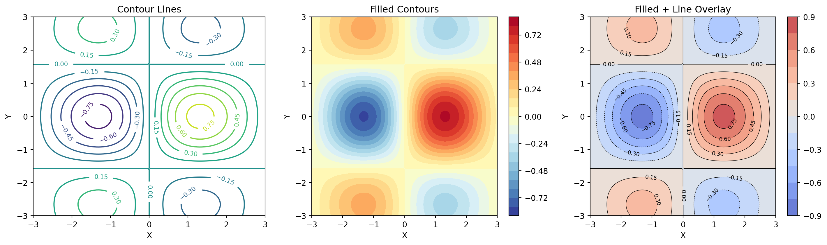
Layout (using GridSpec): - Left (2 rows): 3D surface plot with custom colormap - Top-right: Heatmap (imshow) of the same function - Middle-right: Contour plot with labeled contour lines - Bottom (full width): Two cross-section line plots: - z vs x at y=0 (blue) - z vs x at y=π/2 (red)
Requirements: 1. Consistent colormap across surface, heatmap, and contour 2. Shared colorbar for the three 2D representations 3. Proper axis labels with LaTeX formatting 4. Super title and panel labels (A, B, C, D) 5. Custom GridSpec with width_ratios and height_ratios 6. Tight layout with no overlapping elements
Part 4: Expert Techniques
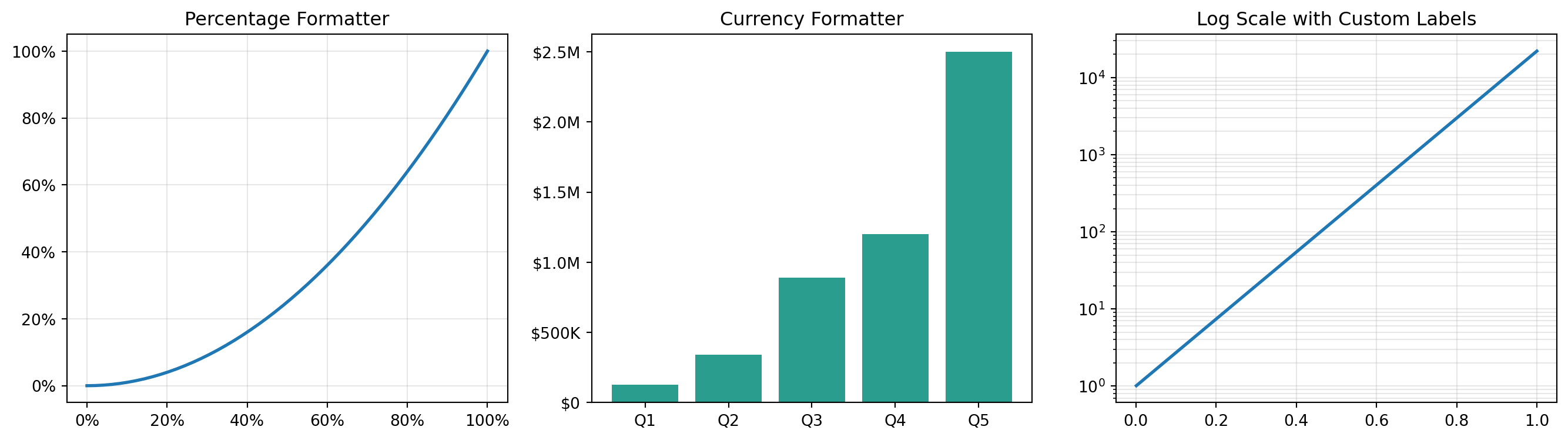
Q35. How do I create custom tick formatters?
Answer: Use FuncFormatter from matplotlib.ticker.
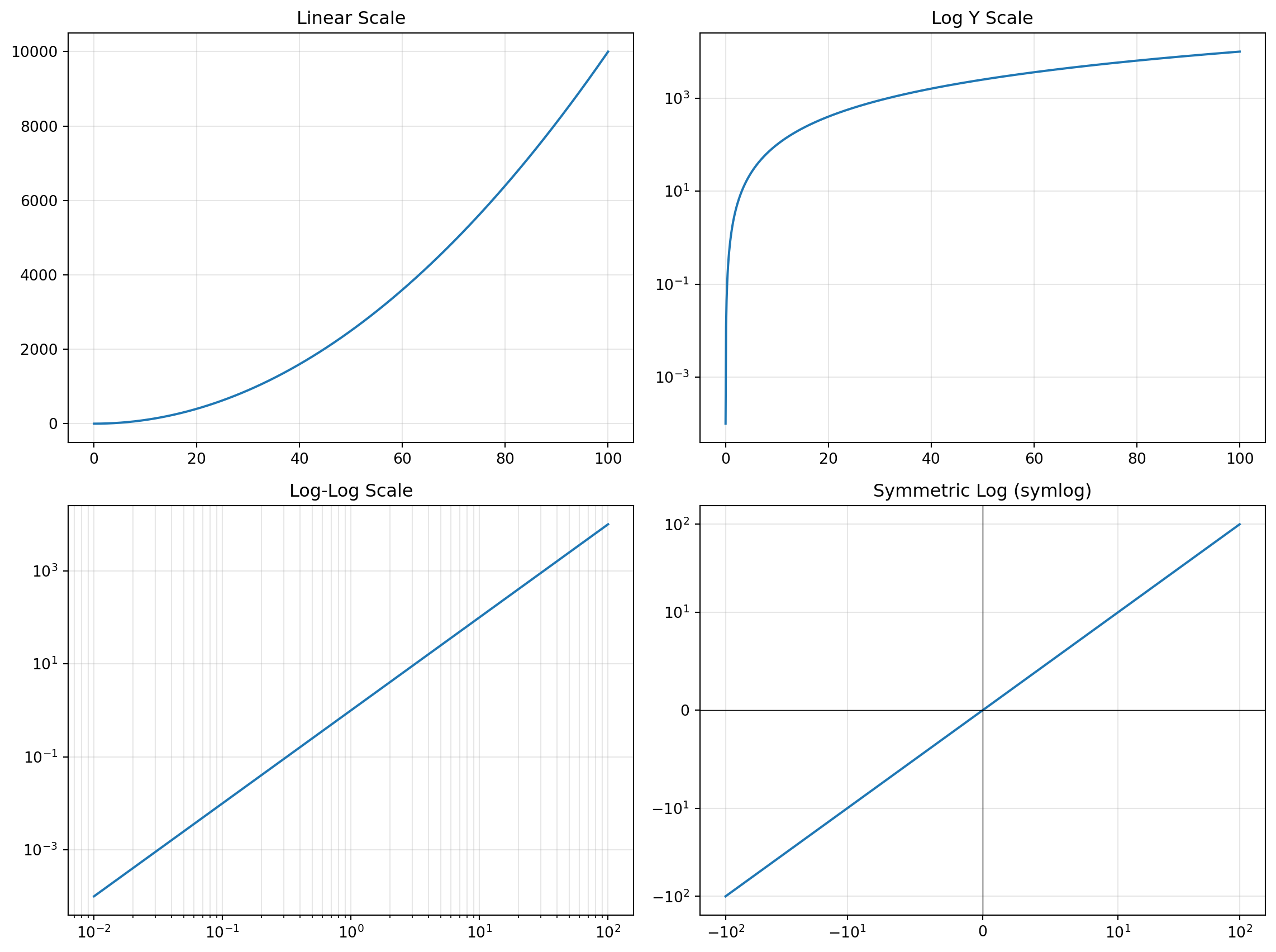
from matplotlib.ticker import FuncFormatter, MultipleLocatorfig, axs = plt.subplots(1, 3, figsize=(14, 4))# Percentage formatterdef percent_fmt(x, pos):returnf'{x*100:.0f}%'x = np.linspace(0, 1, 50)y = x**2axs[0].plot(x, y, linewidth=2)axs[0].xaxis.set_major_formatter(FuncFormatter(percent_fmt))axs[0].yaxis.set_major_formatter(FuncFormatter(percent_fmt))axs[0].set_title("Percentage Formatter")axs[0].grid(alpha=0.3)# Currency formatterdef currency_fmt(x, pos):if x >=1e6:returnf'${x/1e6:.1f}M'elif x >=1e3:returnf'${x/1e3:.0f}K'returnf'${x:.0f}'sales = np.array([125000, 340000, 890000, 1200000, 2500000])axs[1].bar(range(5), sales, color='#2a9d8f')axs[1].yaxis.set_major_formatter(FuncFormatter(currency_fmt))axs[1].set_xticklabels(['Q1', 'Q2', 'Q3', 'Q4', 'Q5'])axs[1].set_xticks(range(5))axs[1].set_title("Currency Formatter")# Scientific formatter with custom precisiondef sci_fmt(x, pos):if x ==0:return'0' exp =int(np.floor(np.log10(abs(x)))) coef = x /10**expreturnf'{coef:.1f}×10$^{{{exp}}}$'x = np.linspace(0.001, 1, 100)y = np.exp(x*10)axs[2].semilogy(x, y, linewidth=2)axs[2].set_title("Log Scale with Custom Labels")axs[2].grid(alpha=0.3, which='both')plt.tight_layout()plt.show()
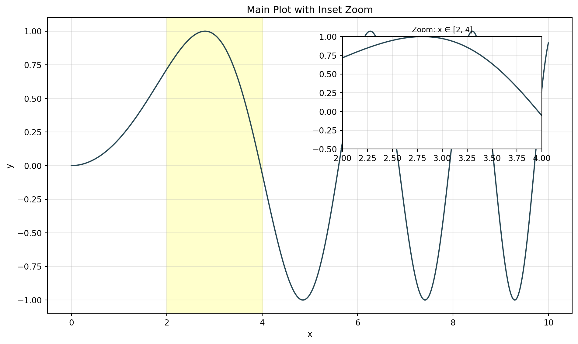
Q36. How do I create inset axes (zoom views)?
Answer: Use inset_axes from mpl_toolkits.axes_grid1.
from mpl_toolkits.axes_grid1.inset_locator import inset_axes, mark_insetfig, ax = plt.subplots(figsize=(10, 6))# Main plotx = np.linspace(0, 10, 1000)y = np.sin(x**2/5)ax.plot(x, y, linewidth=1.5, color='#264653')ax.set_title("Main Plot with Inset Zoom")ax.set_xlabel("x")ax.set_ylabel("y")ax.grid(alpha=0.3)# Create inset axesaxins = inset_axes(ax, width="40%", height="40%", loc='upper right', bbox_to_anchor=(0, 0, 0.95, 0.95), bbox_transform=ax.transAxes)# Plot same data in insetaxins.plot(x, y, linewidth=1.5, color='#264653')axins.set_xlim(2, 4) # Zoom regionaxins.set_ylim(-0.5, 1)axins.grid(alpha=0.3)axins.set_title("Zoom: x ∈ [2, 4]", fontsize=9)# Mark the zoom region on main plotax.axvspan(2, 4, alpha=0.2, color='yellow')plt.tight_layout()plt.show()
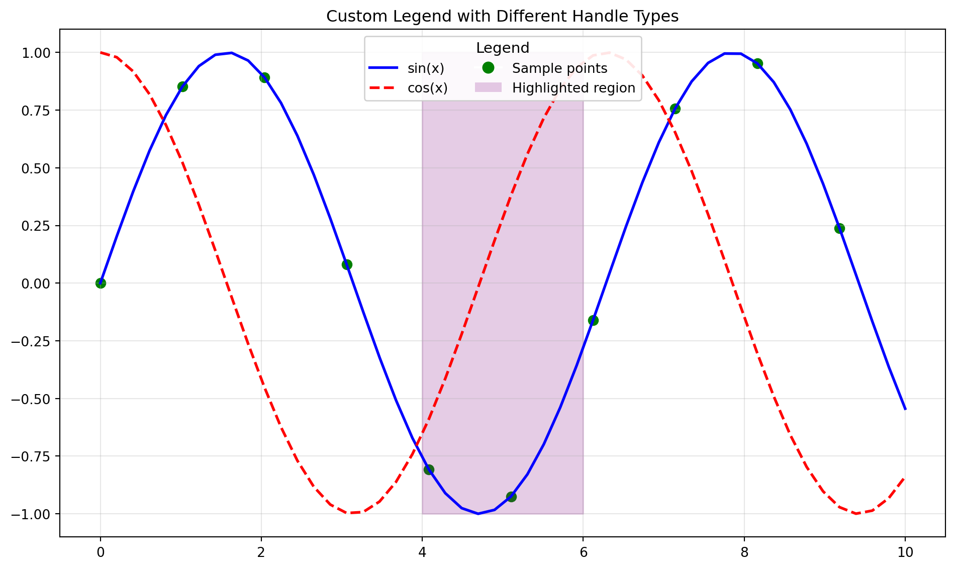
Q37. How do I create custom legends?
Answer: Use custom handles, labels, and legend positioning options.
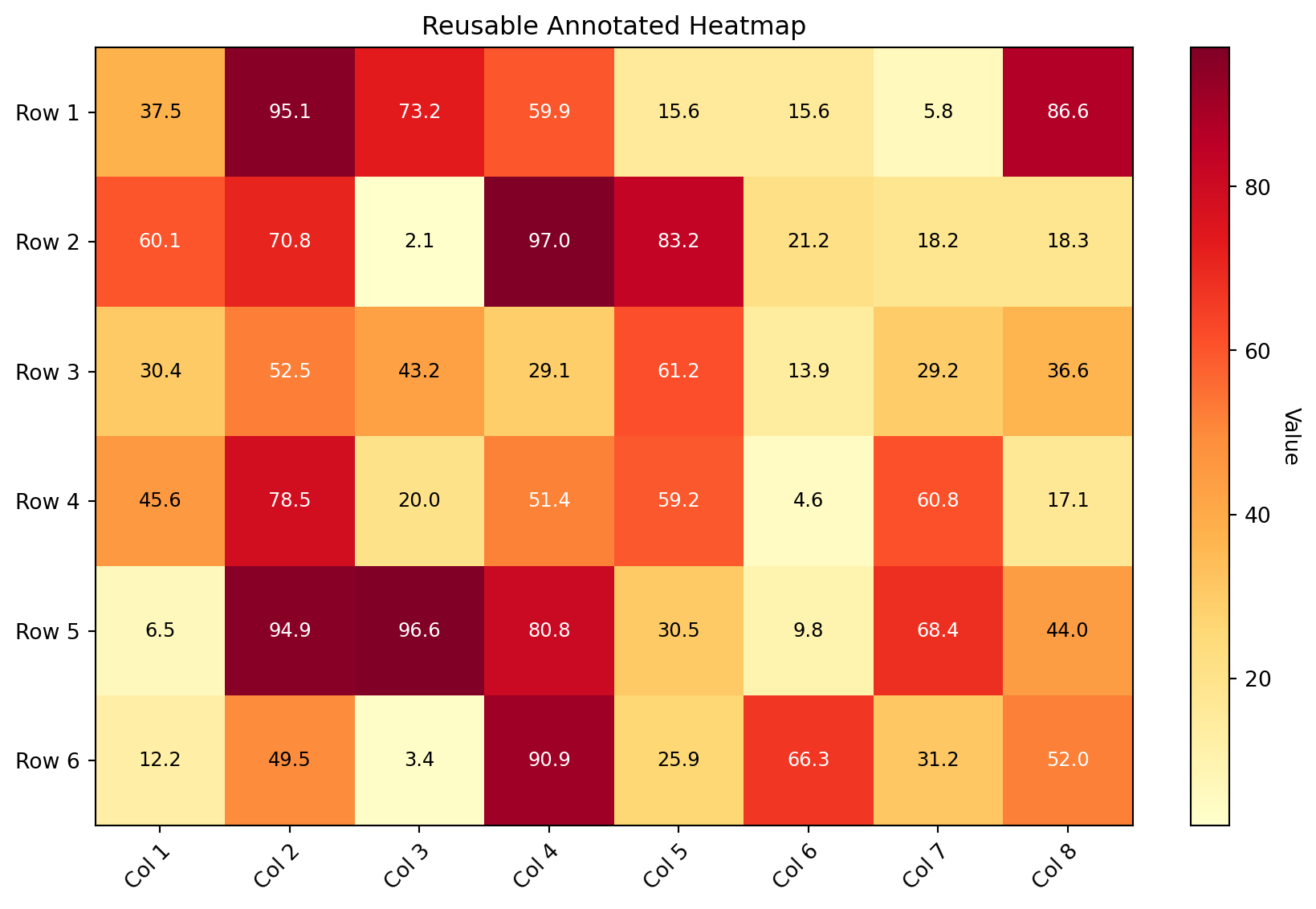
Q41. How do I create annotated heatmaps efficiently?
Answer: Use a reusable function with proper text color contrast.
def annotated_heatmap(data, row_labels, col_labels, ax=None, cmap='viridis', fmt='.2f', cbar_label='', title=''):"""Create an annotated heatmap with automatic text color selection."""if ax isNone: ax = plt.gca() im = ax.imshow(data, cmap=cmap)# Color bar cbar = ax.figure.colorbar(im, ax=ax, fraction=0.046, pad=0.04) cbar.ax.set_ylabel(cbar_label, rotation=-90, va="bottom")# Ticks ax.set_xticks(np.arange(len(col_labels))) ax.set_yticks(np.arange(len(row_labels))) ax.set_xticklabels(col_labels) ax.set_yticklabels(row_labels)# Rotate tick labels plt.setp(ax.get_xticklabels(), rotation=45, ha="right", rotation_mode="anchor")# Annotate cells with automatic text color text_threshold = (data.max() + data.min()) /2for i inrange(len(row_labels)):for j inrange(len(col_labels)): color ="white"if data[i, j] > text_threshold else"black" ax.text(j, i, format(data[i, j], fmt), ha="center", va="center", color=color, fontsize=9) ax.set_title(title)return im# Demonp.random.seed(42)data = np.random.rand(6, 8) *100rows = [f'Row {i+1}'for i inrange(6)]cols = [f'Col {i+1}'for i inrange(8)]fig, ax = plt.subplots(figsize=(10, 6))annotated_heatmap(data, rows, cols, ax=ax, cmap='YlOrRd', fmt='.1f', cbar_label='Value', title='Reusable Annotated Heatmap')plt.tight_layout()plt.show()
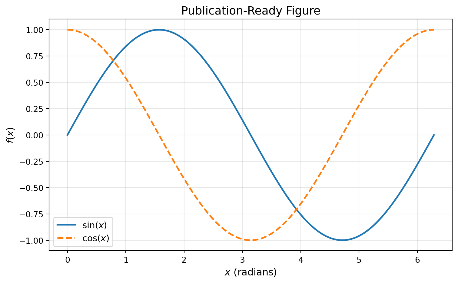
Q42. How do I save plots in publication-quality formats?
Answer: Use high DPI for raster, and vector formats (PDF/SVG) for publications.
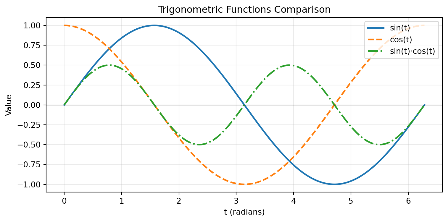
fig, ax = plt.subplots(figsize=(8, 5))x = np.linspace(0, 2*np.pi, 100)ax.plot(x, np.sin(x), linewidth=2, label=r'$\sin(x)$')ax.plot(x, np.cos(x), linewidth=2, linestyle='--', label=r'$\cos(x)$')ax.set_xlabel(r'$x$ (radians)', fontsize=12)ax.set_ylabel(r'$f(x)$', fontsize=12)ax.set_title('Publication-Ready Figure', fontsize=14)ax.legend(fontsize=11)ax.grid(alpha=0.3)# Different save options (uncomment to save)# fig.savefig('figure.png', dpi=300, bbox_inches='tight', facecolor='white') # Web/slides# fig.savefig('figure.pdf', bbox_inches='tight') # LaTeX publications# fig.savefig('figure.svg', bbox_inches='tight') # Scalable, editable# fig.savefig('figure.eps', bbox_inches='tight') # Some journals require EPSprint("Save options:")print("- PNG: dpi=300+ for print, dpi=150 for web")print("- PDF: Vector, perfect for LaTeX") print("- SVG: Editable in Inkscape/Illustrator")print("- EPS: Legacy format for some journals")plt.tight_layout()plt.show()
Save options:
- PNG: dpi=300+ for print, dpi=150 for web
- PDF: Vector, perfect for LaTeX
- SVG: Editable in Inkscape/Illustrator
- EPS: Legacy format for some journals
Q43. How do I create reusable plotting functions?
Answer: Define functions that accept data and styling parameters, returning figure/axes.
Create a bar chart of values in thousands (e.g., [15000, 28000, 42000, 38000, 51000]).
Requirements: - Y-axis shows formatted values like “15K”, “28K”, etc. - Use FuncFormatter from matplotlib.ticker - Title and proper labels
Challenge 2 (Easy): Basic Animation Setup
Create a static frame showing the setup for an animated sine wave.
Requirements: - Draw a sine wave that would animate through phase shifts - Add a moving marker point on the curve - Set axis limits appropriately - Add title showing frame number placeholder
Challenge 3 (Moderate): Inset Zoom with Connection
Plot a noisy signal over 100 points and add an inset zoom view.
Requirements: - Main plot: full signal with noise - Inset axes (30% width, 30% height) in upper-right - Zoom into the region x ∈ [40, 60] - Visual connector lines/box highlighting the zoomed region - Different background color for inset
Challenge 4 (Moderate): Custom rcParams Theme
Create a reusable plotting theme and apply it to multiple plots.
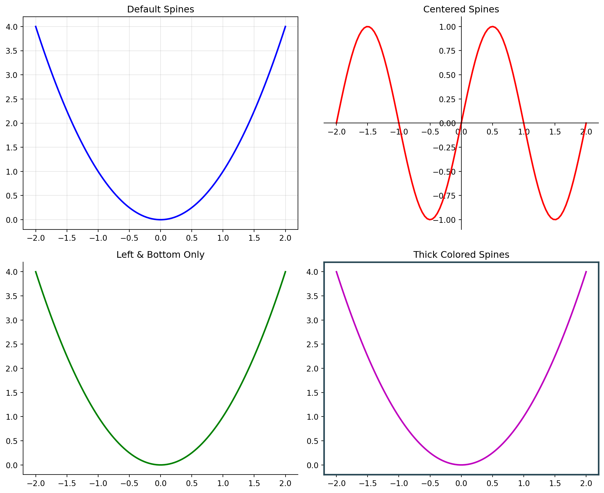
Requirements: - Define a custom style dictionary with: - Sans-serif font family - Larger font sizes (12pt base) - No top/right spines - Custom color cycle (at least 5 colors) - Grid enabled by default - Create a 1×3 subplot showing line, bar, and scatter plots - All plots should inherit the custom theme
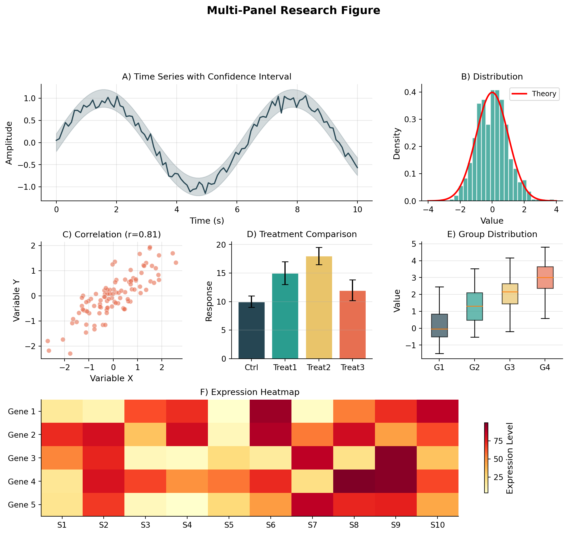
Challenge 5 (Difficult): Complete Publication Figure with Everything
Create a journal-ready figure combining multiple advanced techniques:
Layout: 2×3 grid using GridSpec with varying sizes
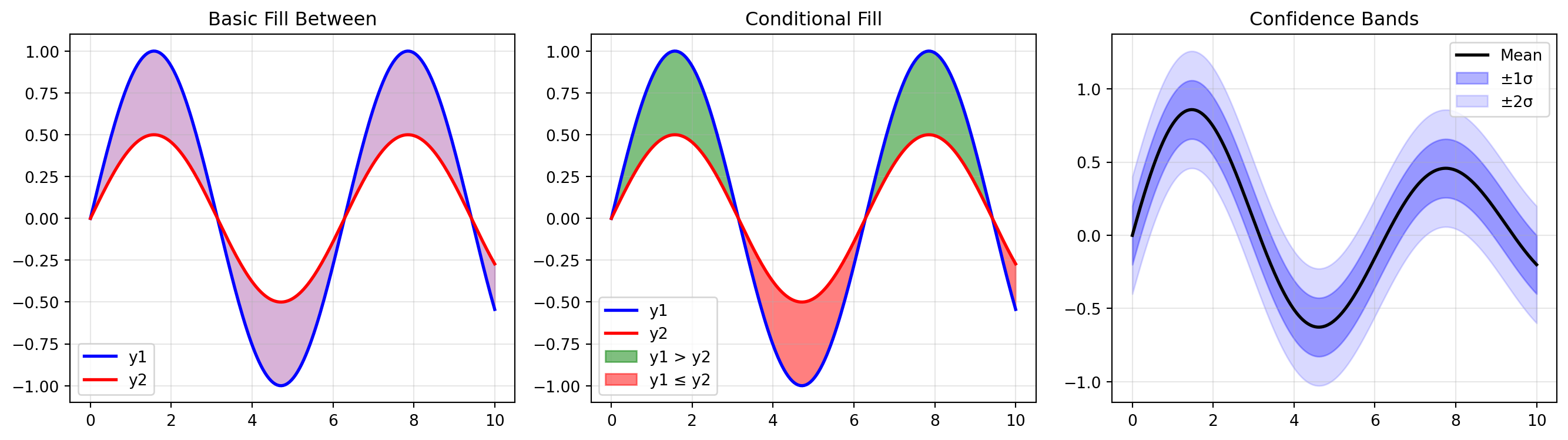
Panel A (top-left, large): Time series with: - Main line and confidence band (fill_between) - Inset zoom of peak region - Custom date formatting on x-axis
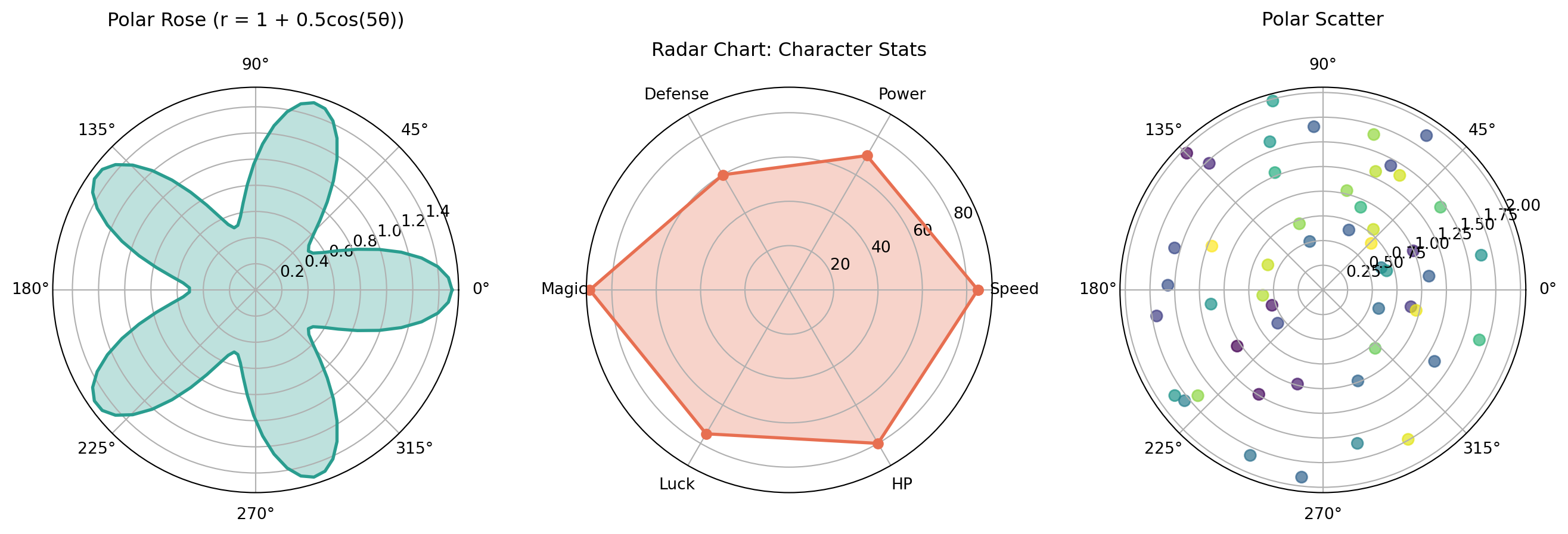
Panel B (top-right): Polar radar chart showing 6 metrics
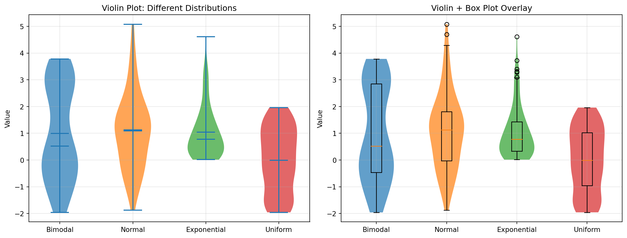
Panel C (middle-left): Violin plot with overlaid strip plot (jittered points)
Panel D (middle-right): Annotated heatmap with custom colormap
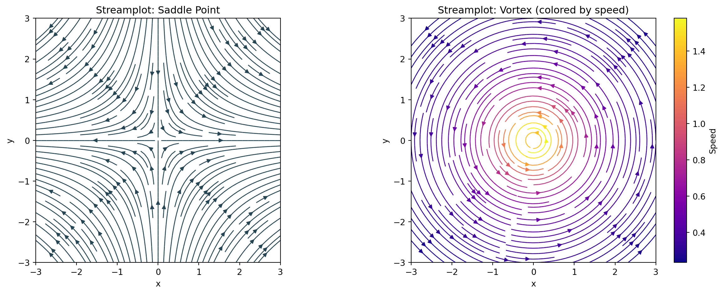
Panel E (bottom, full width): Streamplot of a vector field with: - Colored by magnitude - Quiver overlay at sparse points
Requirements: 1. Consistent color palette throughout 2. Panel labels (A, B, C, D, E) in corners 3. LaTeX-formatted axis labels where appropriate 4. All fonts suitable for publication (11pt minimum) 5. No overlapping elements with tight_layout 6. Export-ready at 300 DPI